Have we said all we can say about mobile website design? Hardly. There are thousands of excellent resources available for anyone serious about responsive and mobile-first design. Below are some of the most respected and useful resources, organized by purpose.
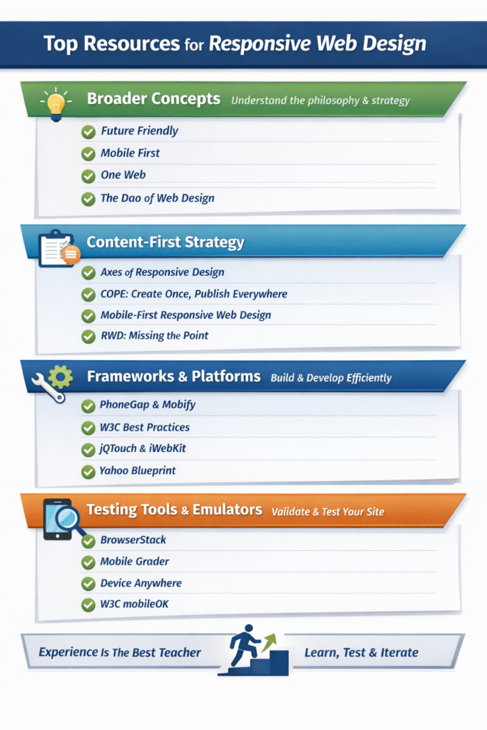
Broader Concepts: Understanding the Big Picture
Start here if you want to understand why responsive design exists and how it fits into long-term SEO and usability strategies.
-
Future Friendly – Why adaptable websites outperform rigid designs
-
Mobile First – Luke Wroblewski’s foundational mobile-first philosophy
-
One Web – W3C’s vision of a unified web experience
-
The Dao of Web Design – A classic essay on flexible web design
These resources help designers think beyond screen sizes and focus on long-term adaptability.
Content-First Responsive Design Thinking
Responsive design starts with content, not layout. These resources explain how to structure content so it scales across devices.
-
Axes of Responsive Design – A framework for responsive flexibility
-
COPE: Create Once, Publish Everywhere – Managing content across platforms
-
Mobile-First Responsive Web Design – Designing from constraints upward
-
RWD: Missing the Point – A critique of shallow responsive design
Content-first thinking leads to faster, clearer, and more effective mobile experiences.
Frameworks, Platforms, and Practical Guides
These tools act as scaffolding for building responsive and mobile-optimized websites efficiently.
-
PhoneGap – Build mobile apps using HTML and JavaScript
-
MoFuse – Mobile website platform
-
Mobify – Hosted mobile commerce platform
-
Wapple – Mobile content delivery platform
-
iWebKit – Mobile framework for iOS-style interfaces
-
Bluetrain Mobile – Mobile platform and consulting
-
jQTouch – jQuery framework for mobile WebKit
-
Yahoo! Blueprint – Mobile development guidelines
-
mobiSiteGalore – Free mobile website builder
-
Mobi10 – Hosted mobile site platform
These frameworks help reduce development time while maintaining consistency.
Validation, Emulators, and Testing Tools
Once your site is built, testing ensures it works in real-world conditions.
-
BrowserStack – Desktop and mobile emulators
-
Mobile Grader – Mobile performance analysis
-
Opera Mini – Low-bandwidth browsing tests
-
Device Anywhere – 1,500+ device testing
-
mobiletest.me – Multi-device emulator
-
ready.mobi – Mobile readiness checker
-
Mowser – View mobile versions of websites
Testing tools ensure your mobile design performs as intended across devices and networks.
Final Thought
No resource list can replace experience. Great responsive designers are built through testing, iteration, and real user feedback. However, these links provide a powerful foundation and a reliable reference as mobile design standards continue to evolve.
FAQ
What are responsive web design resources used for?
They help designers learn principles, frameworks, and testing methods for building mobile-friendly websites.
Should beginners start with frameworks or concepts?
Concepts first. Understanding why responsive design works makes frameworks easier to use effectively.
Are testing tools really necessary for mobile design?
Yes. Mobile behavior varies widely across devices, making testing essential for usability and performance.
Is mobile-first design still relevant today?
Absolutely. Mobile-first design improves clarity, speed, and long-term adaptability.
Can tools replace real-world experience?
No. Tools support learning, but experience and iteration create truly effective mobile designers.