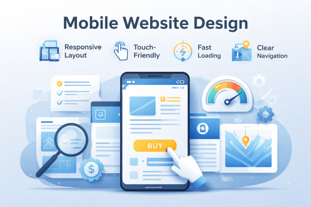
Mobile website design isn’t just a smaller version of desktop design. It follows its own set of rules, constraints, and user expectations.
What makes mobile design truly different comes down to two major factors: technical limitations and usability behavior. Ignoring either one leads to poor performance, frustrated users, and lost conversions.
The Technical Challenges of Mobile Website Design
Designing for mobile means working within stricter technical boundaries than desktop environments.
Screen Size Variability
Mobile screen sizes are wildly inconsistent.
Even today, there is no universal standard. Devices range from compact phones to oversized screens, each with different resolutions, aspect ratios, and pixel densities. While responsive design helps, no layout can perfectly adapt to every screen without overly complex code.
Effective mobile design prioritizes:
-
Flexible layouts
-
Scalable typography
-
Clear visual hierarchy
The goal isn’t perfection on every device—it’s usability on all of them.
Touchscreen Interaction Limitations
Touchscreens change how users interact with websites.
Mobile users don’t hover, right-click, or drag precisely. Buttons must be:
-
Large enough to tap comfortably
-
Clearly separated
-
Easy to recognize
Simple interactions outperform clever ones on mobile. If a task requires fine motor control, it’s already too complex.
Mobile Network Performance Constraints
Mobile connections remain unpredictable.
Users expect fast loading, yet they also want rich content like images and video. This creates a constant balancing act between performance and information depth.
Strong mobile design focuses on:
-
Optimized images
-
Minimal scripts
-
Progressive loading
Speed is not optional—it’s a usability feature.
Mobile Usability: Designing for Real Life
Technical performance alone doesn’t guarantee success. Usability defines whether users stay or leave.
Less Text, More Clarity
Mobile screens make reading harder.
Even well-spaced text can feel overwhelming on smaller displays. Users often prefer scanning visual cues rather than reading long paragraphs.
That’s why mobile design emphasizes:
-
Short text blocks
-
Clear headings
-
Visual guidance
The goal is comprehension at a glance.
Designing for Distracted Users
Mobile users are rarely focused.
They may be walking, multitasking, or holding a child. Interfaces must be obvious and forgiving.
Good mobile usability:
-
Anticipates user intent
-
Makes primary actions unmistakable
-
Reduces decision fatigue
When in doubt, simplify.
Supporting Secondary Actions
Not every user wants the same thing.
Some visitors need immediate action. Others want more details. Smart mobile design surfaces primary actions first, while still providing easy access to secondary tasks.
A common solution is:
-
A focused homepage
-
A secondary navigation or task page
-
Clear pathways between them
This prevents clutter while maintaining flexibility.
Where SEO Fits Into Mobile Design
Mobile design and SEO are tightly connected.
Search engines increasingly evaluate sites based on mobile performance. Poor usability, slow load times, or confusing layouts negatively impact rankings.
A mobile-friendly design isn’t just good UX—it’s a ranking requirement.
FAQ
What makes mobile website design different from desktop design?
Mobile design must account for small screens, touch interactions, and variable network speeds, all of which change how users interact with content.
Why is screen size such a challenge for mobile design?
Mobile devices use many different resolutions and aspect ratios, making it impossible to design for one fixed layout.
Are touchscreen issues harder than mouse-based design?
No. Touch design is simpler when interfaces avoid hover actions and rely on clear, tappable elements.
Why is speed so important on mobile websites?
Mobile users expect fast access despite unstable connections, making performance optimization essential.
Does mobile usability affect SEO rankings?
Yes. Search engines prioritize mobile-friendly sites, especially for users searching on mobile devices.