When it comes to mobile website design, there are two primary approaches businesses use today.
The first is responsive design, where a single website adapts itself to different screen sizes. The second is an independent mobile website, where a separate version of the site is built specifically for mobile users.
Both approaches are widely used. Both work. But they solve different problems—and choosing the wrong one can limit performance, usability, and long-term growth.
Responsive Website Design Explained
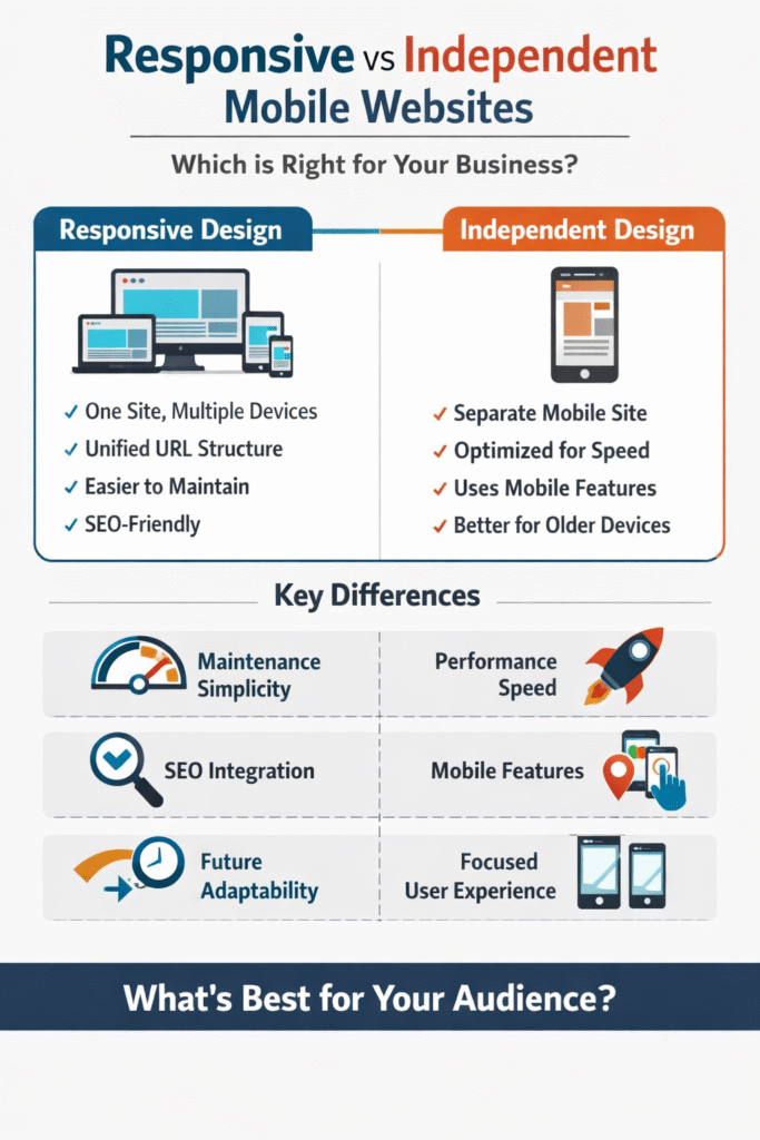
Responsive design uses a single website that adjusts itself based on the device accessing it.
The site sends CSS media queries to the user’s device, asking for details like screen size and orientation. Based on the response, the layout, spacing, and content presentation change dynamically.
Advantages of Responsive Websites
Responsive websites offer several strategic benefits:
-
A single website to manage and update
-
Unified URLs and content structure
-
Easier long-term maintenance
-
Strong compatibility with modern SEO practices
Because everything lives in one place, responsive sites simplify content management and reduce duplication issues.
Independent Mobile Website Design Explained
Independent mobile websites are built separately from desktop sites.
They are not simply resized versions of the same pages. Instead, they are designed from the ground up for mobile behavior, mobile speed, and mobile intent.
This approach often uses a different URL structure or routing logic to serve mobile users a distinct experience.
Advantages of Independent Mobile Websites
Independent mobile sites excel in areas where performance and specialization matter:
-
Faster load times with lower bandwidth usage
-
No hidden desktop content loading in the background
-
Compatibility with older mobile browsers
-
Ability to use mobile-only features like geolocation and touch-specific interactions
For businesses that rely heavily on mobile traffic, these benefits can significantly improve user experience.
Performance vs. Future Flexibility
The real decision comes down to priorities.
Responsive websites are generally more future-proof. As new devices appear, a single responsive framework adapts more easily.
Independent websites, however, tend to feel smoother and more intentional for mobile users right now. They remove unnecessary content and focus entirely on mobile goals.
Neither approach is universally better.
Choosing the Right Approach for Your Business
The right choice depends on:
-
Your audience’s device usage
-
Your performance requirements
-
Your development resources
-
Your SEO strategy
Some businesses even use a hybrid approach. What matters most is that mobile users get a fast, clear, and intuitive experience.
FAQ
What is the difference between responsive and independent mobile websites?
Responsive sites adapt one website to all devices, while independent mobile sites are separate versions built specifically for mobile users.
Are responsive websites slower than independent mobile sites?
They can be, because responsive sites often load hidden desktop content that mobile users never see.
Do independent mobile websites affect SEO?
They require careful SEO configuration, but when done correctly, they can perform just as well as responsive sites.
Which approach is better for future devices?
Responsive design is generally more adaptable to new screen sizes and devices.
Can businesses switch between approaches later?
Yes, but switching requires planning to avoid SEO and usability issues.