In the first volume of this mini-course, we established a foundation: you already understand website design in general. Now it’s time to unlearn a few things.
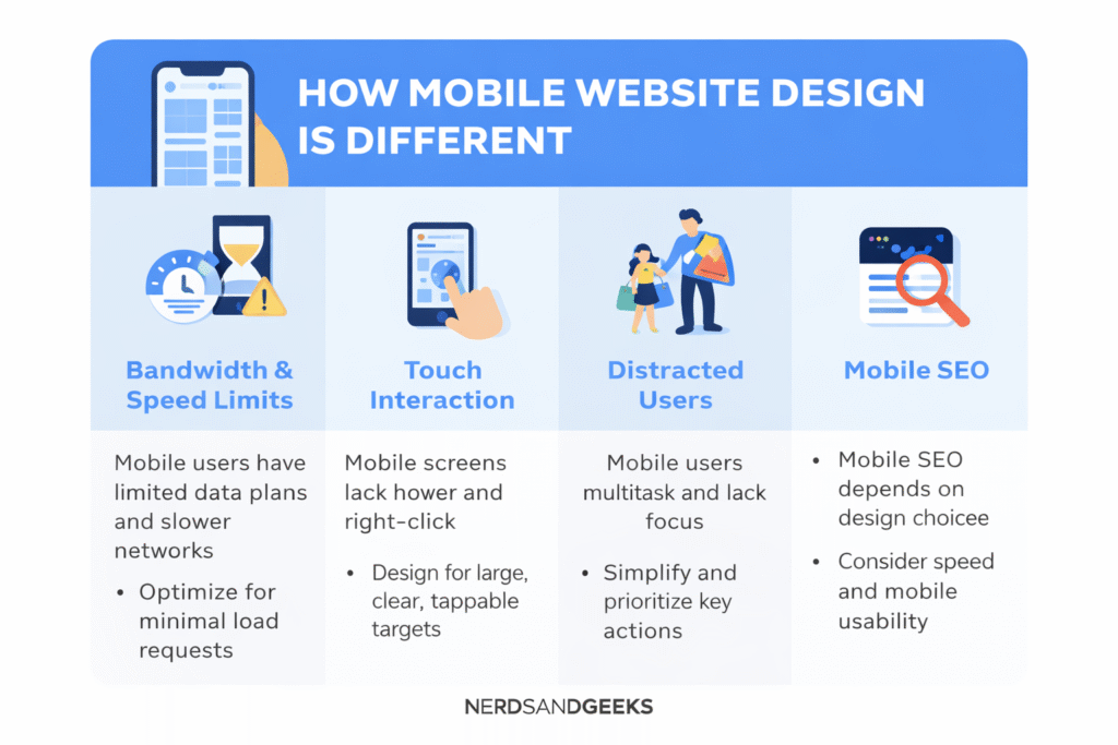
Mobile websites operate under very different constraints than desktop websites. Ignoring those differences leads to slow load times, frustrated users, and poor conversions. Understanding them is the key to building mobile sites that actually work.
Bandwidth and Speed Limitations
Mobile users often operate under limitations desktop users never face.
Many mobile devices rely on limited data plans or unstable network connections. Large pages with excessive requests can drain bandwidth and drive users away before the site even loads.
To avoid this:
-
Reduce HTTP requests
-
Optimize images aggressively
-
Avoid unnecessary scripts
-
Delay or remove heavy media
Speed is not just a technical concern—it’s a usability requirement.
Touchscreen Interaction Changes Everything
Mobile devices don’t have mice.
They don’t support hover states, fine cursor movement, or right-click interactions. Instead, they rely entirely on touch input.
That means:
-
No hover-based menus
-
No tiny clickable elements
-
No drag-heavy interactions
Design must accommodate fingers, not cursors. Large buttons, clear spacing, and simple gestures outperform complex interaction patterns every time.
Purpose-Built for Real-World Use
Mobile users are not always focused.
They might be multitasking, distracted, or physically limited in how they can interact with the device. This reality changes how content should be presented.
Effective mobile design:
-
Gets to the point immediately
-
Prioritizes primary actions
-
Minimizes cognitive effort
You are designing for people with limited attention and limited time.
Mobile SEO Behaves Differently
Mobile SEO doesn’t exist in isolation.
How a mobile site interacts with its desktop counterpart depends on structural decisions like responsive layouts, separate mobile URLs, or dynamic serving. These choices directly affect indexing, rankings, and visibility.
Mobile design decisions should always consider:
-
Page speed
-
Crawlability
-
Content parity
-
User experience signals
The relationship between mobile and desktop SEO deserves its own discussion—and that’s exactly what comes next.
What Comes Next in the Mini-Course
Now that you understand why mobile design is different, the next step is deciding how your mobile site should coexist with your desktop site.
That critical decision determines everything from SEO strategy to long-term scalability—and we’ll cover it in the next volume.
FAQ
Why is mobile website design different from desktop design?
Mobile design must account for slower networks, smaller screens, and touch-based interaction, which change how users browse and interact.
Why is speed more important on mobile websites?
Mobile users often face bandwidth limits and unstable connections, making fast loading essential for usability and retention.
Can mobile websites use hover-based interactions?
No. Touchscreens do not support hover states, so designs relying on hover interactions fail on mobile devices.
How does user behavior differ on mobile devices?
Mobile users are often distracted or multitasking, requiring simpler layouts and faster access to key information.
Does mobile SEO work the same as desktop SEO?
No. Mobile SEO depends on site structure, speed, and how mobile and desktop versions interact with search engines.