Mobile devices have completely changed how people access the internet. Smartphones, tablets, and high-speed mobile networks allow users to browse websites anytime, anywhere. As a result, businesses can no longer rely on desktop-only websites to meet customer expectations.
A website that works well on a computer often fails on a smaller screen. Text becomes unreadable, buttons are hard to tap, and navigation turns frustrating. That’s why mobile website design is no longer optional—it’s essential for usability, engagement, and SEO.
Here’s how developers transform a traditional website into a fully functional mobile experience.
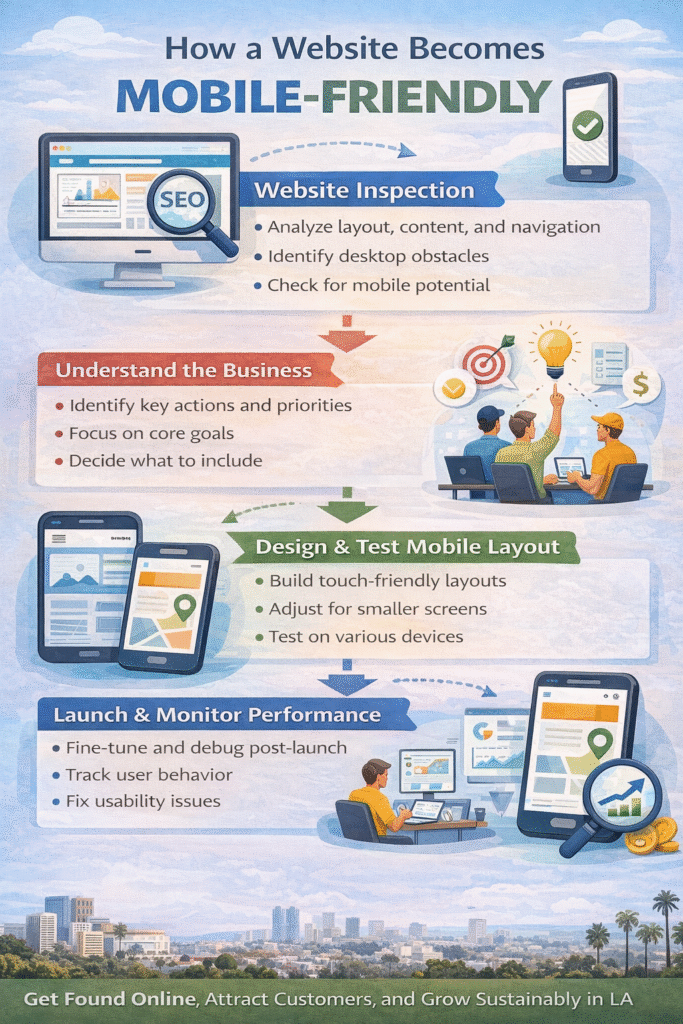
Website Inspection Comes First
Before any design changes begin, developers closely inspect the existing website. This step helps determine what elements translate well to mobile and which ones don’t.
During inspection, developers evaluate:
-
Layout structure
-
Navigation complexity
-
Content hierarchy
-
Images and media usage
The goal is to maintain brand consistency while ensuring usability on smaller screens. A mobile site should feel familiar to existing users while being optimized for touch and limited screen space.
Understanding the Business and Its Goals
Once the technical inspection is complete, developers focus on understanding the business itself. Mobile websites are more compact, so not every feature from the desktop site can—or should—be included.
This step answers key questions:
-
What actions matter most to users?
-
Which pages drive conversions?
-
What information must be immediately accessible?
By prioritizing core goals, developers streamline the mobile experience without losing the essence of the brand.
Designing and Testing the Mobile Experience
After planning comes execution. Developers write mobile-friendly code and create layouts designed specifically for touch interaction and smaller screens.
Key mobile design considerations include:
-
Responsive layouts
-
Readable font sizes
-
Touch-friendly buttons
-
Faster load times
Testing is critical at this stage. Designs are tested across multiple devices, screen sizes, and browsers to ensure consistent performance and usability.
Launch, Monitor, and Debug
Once the mobile site is launched, real users begin interacting with it—and that’s when valuable feedback emerges. Small usability issues, performance gaps, or navigation friction often appear only after launch.
Developers monitor:
-
User behavior
-
Load speed
-
Navigation flow
-
Conversion performance
Fine-tuning continues after launch to ensure the mobile site performs smoothly and meets user expectations.
Why Mobile Website Design Matters
A poorly functioning mobile site drives users away. Visitors expect fast loading, easy navigation, and clear content. If your website doesn’t deliver, they’ll leave—and likely won’t return.
A well-designed mobile website:
-
Improves user experience
-
Increases engagement
-
Supports mobile SEO rankings
-
Helps retain and attract customers
Mobile design isn’t just about shrinking a website—it’s about reimagining it for how people actually browse today.
Frequently Asked Questions
Mobile design?
Mobile website design adapts a desktop website to work seamlessly on smartphones and tablets.
Responsive?
Responsive design automatically adjusts layouts based on screen size and device.
SEO impact?
Mobile-friendly websites rank better in search engines and reduce bounce rates.
Testing needed?
Yes. Testing ensures compatibility across devices and improves usability.
Business value?
Mobile sites improve customer satisfaction, conversions, and long-term retention.
Ready to Grow with Mobile Website Design?
Your customers are already browsing on mobile. The question is whether your website is ready for them.
A well-designed mobile site keeps users engaged, supports SEO, and turns visits into action. NerdsAndGeeks helps businesses build mobile-friendly websites that perform smoothly across all devices and drive real results.