For a long time, mobile website design felt like a mysterious craft. Smartphones were new, screen sizes were unpredictable, and no one really knew how people would use the mobile web.
Now we do.
After years of real-world data and user behavior analysis, it’s clear that mobile website design isn’t about cramming everything into a smaller screen. It’s about making every interaction effortless. When done correctly, mobile design doesn’t just look good—it drives real business results.
Here’s what every small business and SEO company should focus on to maximize ROI from mobile websites.
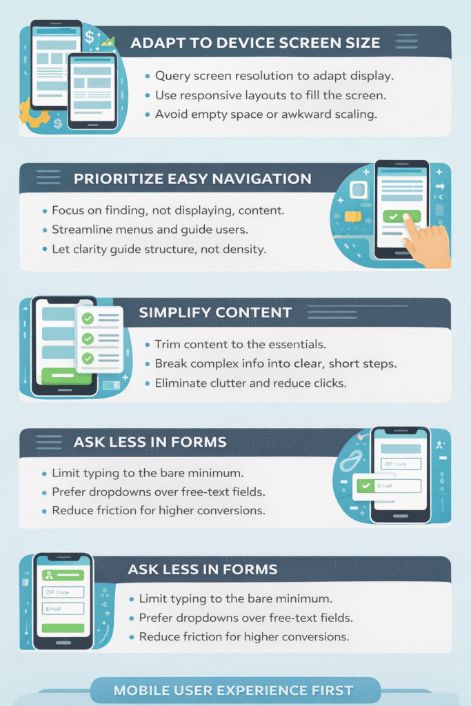
Design for the Screen You’re Actually On
A mobile website must adapt correctly to the device displaying it.
Too many mobile sites still render at incorrect widths or heights, leaving wasted screen space or forcing users to zoom and scroll unnecessarily. If your site displays at two-thirds width on a full-screen device, you’re already losing engagement.
Proper mobile design:
-
Detects screen resolution accurately
-
Uses responsive layouts that fill available space
-
Avoids unnecessary margins and scaling issues
If users have to fight the layout, they won’t stay.
Prioritize Navigation Over Information Density
Mobile users don’t browse the same way desktop users do.
On mobile, finding information matters more than seeing everything at once. It’s perfectly acceptable to push content deeper into the site—as long as the path to reach it is clear and intuitive.
Effective mobile navigation:
-
Makes primary actions obvious
-
Reduces menu complexity
-
Guides users step-by-step
Extra taps aren’t a problem. Confusion is.
Simplify Until There’s Nothing Left to Remove
Great mobile design is ruthless.
Desktop sites benefit from large screens that allow room for visuals, menus, and extra content. Mobile sites don’t have that luxury. Every element must earn its place.
The best approach is:
-
Simplify the layout
-
Remove non-essential content
-
Break complex pages into smaller sections
-
Create a logical hierarchy
If something doesn’t directly help the user accomplish a goal, it doesn’t belong on the first screen.
Reduce Typing at All Costs
Mobile keyboards are universally disliked.
Every additional form field increases friction. Every unnecessary question lowers conversion rates. If you can avoid typing, you should.
Smart mobile forms:
-
Ask only for essential information
-
Use dropdowns or auto-fill when possible
-
Limit required fields
If a ZIP code and email address will do the job, don’t ask for anything more.
User Experience Always Comes First
Mobile website design follows one fundamental rule: user experience over everything else.
Performance, simplicity, navigation, and clarity all serve one purpose—to make the user’s life easier. When mobile design respects that principle, conversions follow naturally.
A profitable mobile website isn’t flashy. It’s frictionless.
FAQ
Why is mobile website design important for ROI?
Mobile design directly affects usability, engagement, and conversions. A poor mobile experience leads to lost customers and wasted traffic.
Should mobile sites show less content than desktop sites?
Yes. Mobile sites should prioritize essential information and move secondary content to deeper pages.
Is responsive design enough for mobile optimization?
Responsive design is a foundation, but true optimization also requires usability testing, speed improvements, and simplified navigation.
Why should forms be shorter on mobile?
Typing on mobile devices is frustrating. Shorter forms reduce friction and significantly improve conversion rates.
What is the most important rule of mobile website design?
Always prioritize user experience. Speed, clarity, and simplicity matter more than visual complexity.